Well I’m impressed, because you’re more likely to read this blog in full than a tabloid according to The Poynter Institute.
However, according to the article the voice of the author captures 30% more attention from readers than expected. So, you’ll have to continue to suffer through my personal writing style, which is more or less just me thinking out loud. It’s a little awkward, silly, hopelessly unfunny and a little bit lame.
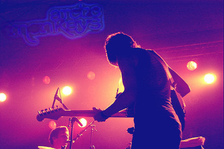
The second thing I learnt was that large colourful pictures obviously drew the attention of the reader. This is why I opted to change the picture in my previous blog from black and white, to colour. This draws the focal attention and the reader is more likely to finish reading the article.
Bright, colourful images catch the eye’s attention.
I choose this theme because it is simple, clear and easy to read. By choosing a simple theme, I am able to design Project Me to reflect my own personality. The font is bold and easy to read. The large, bold headlines which are apart of this headline attract more attention, meaning the eye will be drawn and subsequently read the associated text.


