Behind The Banner

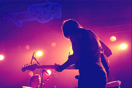
If you haven’t guessed it yet, I’m into all things music.

line

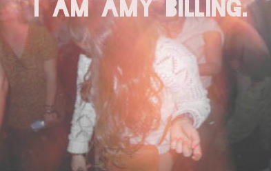
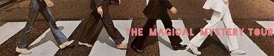
To support this long winded love affair, I have opted for a simple banner that depicts one of the biggest bands of all time, and one of my personal favourites: The Beatles. The combination of a cropped version of an iconic image, teamed with one of The Beatles song titles is a subtle, but quirky reference to my love and appreciation of music.

beatles

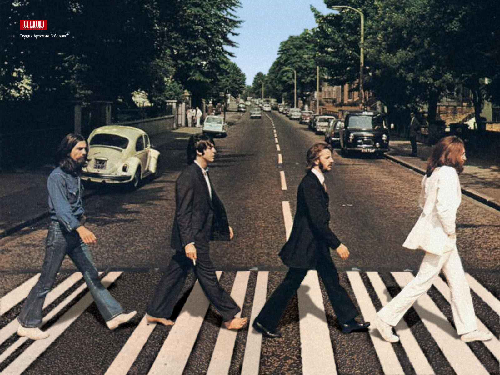
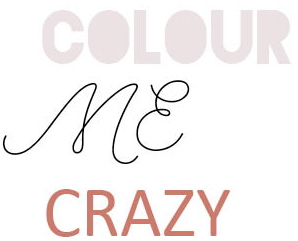
The words ‘Magical Mystery Tour’ are shown in my themcolour which is stamped across the cropped photo to resemble a band poster. The simple yet effective banner speaks to a group that is musically inclined, and is inviting to visitors. ‘Magical Mystery Tour’ is a reference to my crazy mind and thoughts, and it is my own way of personalising my banner in a way that represents the brand that is ‘Amy Billing’. 

Colour Me Crazy

KONICA MINOLTA DIGITAL CAMERA

Colours say a lot about our emotions, and our feelings. We blush red when we’re embarrassed, and that sends a signal to others about our emotions and the same goes for our web presence.

line

The colour scheme for my blog is very basic. I’ve generally stuck with the same colour scheme consistently throughout my blog. My blog consists of a light pink, black, and coral – all on a basic white backdrop. Coral, a slight variation from the colour orange is said to be associated with action. My colour scheme is consistent and simple – which works well throughout my blog. See below an example of my three chosen colours. The first colour: pale pink is only used on dark backdrops, for example: it is seen on my banner, and on the picture of myself, therefore there is a strong contrast between the text and the image. Black is used for all my main bodies of text, simple because it is easy to read and I use coral (orange colour) to add a little excitement to my page.

COLOUR ME

The Full Fonty

type-mash2

The same way clothing is a form of self expression, the front we choose to represent our web presences can actually help to shape and define your online image.

My font should scream quirky, personable yet professional as well as grabbing the eye’s attention. However, styles like Comic Sans and other handwritten-style fonts convey personality quickly, but they tend to look inauthentic and childish.

Old Faithful, Serif and San Serif

line

fonts

Both Serif and San Serif fonts are both appropriate to use in large bodies of text, because they are easy to read. Serif in particular is perfect for technical documents, Web text, and online news. Not wanting to deviate from fonts that are proven to be easy for audiences to read, I opted for a San Serif style font.

line

FONTS22

Calibri is a humanised version of San Serif (similar to Arial) and it is my preferred font. Which I have matched with capitalised headings consistently throughout my blog.

Calibri

FONTS22 2

I also picked Blackout Midnight to co-inside with my personal photograph. I found this bold, graffiti style font suited the style and persona of my photograph, as well as adding a little edge to my blog. This font only appears on the backdrop of photographs because it represents the feel of street posters (band/artist posters).

Amature Hour

creativedrinks

line

For the last nine months I have been contributing to Creative Drinks, a local brisbane blog that aims to connect creatives with other creatives. This has been an excellent opportunity, as I am able to express my passion for music and gain more literary experience.

I write about things that inspire me, artists and bands that I’m listening to at that particular time. I also write about wisdom I wish someone else had shared with me, or when that fails, I write about what’s going on in my head. I find writing is an excellent way to express myself and put all my thoughts onto paper.

Screen Shot 2013-10-09 at 1.07.04 PM

I have linked an album review of Rhye. I chose this piece because it showcases my journalist writing style as relaxed, light and cool, that of course being my preferred writing style. This article also shows that I can talk to talk. A big part of music journalism is being able to to understand and write in industry speak: and I believe this article shows my ability to know and understand music. The article is short and sweet, with a large headline and picture directly below, which should draw the attention of potential readers.

You can see an album review I did of Rhye here, and see my full portfolio at Creative Drinks here.

About My About Me

i am amy billing

line

‘Me, myself and Amy’ is an example of the passion and the creativity that I would bring to my dream job at Rolling Stone Magazine. It is honest, a reflection of my personality and full of passion towards my greatest loves: music.

The ‘about me’ portion of Project Me aims to build a relationship between myself and the reader. By talking about my childhood, the reader is able to make positive assumptions and associations about how my childhood has shaped the person I am today. I am a personable person so I love to develop a relationship with those who read my work, at the same time trying to develop the brand that is ‘Amy Billing’. I then attempt to highlight my strengths without sounding like a resume, passion, creativity, motivated & driven, inquisitive, quirky & unique.

The photo I have chosen to represent myself on ‘Project Me’ is a photo snapped at Bigsound 2013, as a clicked my fingers and dance away to The John Steel Singers . I believe this picture shows me in what I like to call my ‘natural habitat’, listening to live music. The photo emits warm orange colours, and high levels of exposure. As well as this, the photograph is a little out of focus, which transpires my personality and my love of music. I am a little off beat, full of warmth and in one of my favourite places on earth – in an audience. I believe this photo embodies the brand that is ‘Amy Billing’.

i am amy billing 2

You Wont Read This

Well I’m impressed, because you’re more likely to read this blog in full than a tabloid according to The Poynter Institute.

line

However, according to the article the voice of the author captures 30% more attention from readers than expected. So, you’ll have to continue to suffer through my personal writing style, which is more or less just me thinking out loud. It’s a little awkward, silly, hopelessly unfunny and a little bit lame.

The second thing I learnt was that large colourful pictures obviously drew the attention of the reader. This is why I opted to change the picture in my previous blog from black and white, to colour. This draws the focal attention and the reader is more likely to finish reading the article.

Arctic_Monkeys________by_neilo20

Bright, colourful images catch the eye’s attention.

line

I choose this theme because it is simple, clear and easy to read. By choosing a simple theme, I am able to design Project Me to reflect my own personality. The font is bold and easy to read. The large, bold  headlines which are apart of this headline attract more attention, meaning the eye will be drawn and subsequently read the associated text.

Livin’ The Dream

When I dream about that perfect career, that dream job, I’m thinking about something that rolls all my passions into one sweet tasty little jam filled bun.

line

Working for Rolling Stone magazine as a music writer is just that. I love to write but most importantly I love to watch live music, discover new talent and share it with other music lovers.

rolling stone

As my university career comes to an end, I’ve been seeking work experience within the media communications fields, which lead me to my current position as music contributor for a local blog. It is in this position that I’ve discovered my own writing technique and how to communicate my own personality through a specific medium. However, my writing skills are still far from perfect. My grammar, spelling and editing skills all need to be further developed, but that’s how you get to that’s how you get to Carnegie Hall, right? Asides from work experience, to stand out from the crowd I need to develop my own portfolio to showcase my work. The development of my own blog and/or publication is crucial. This shows I am self motivated and have a true passion for both music and writing and all experience is good experience.

BruceCovers4Rolling Stone cover featuring Bruce Springsteen

But there is just one little thing standing in my way; an industry that has been dubbed to be in decline. Not only will I face a highly competitive industry but my dream job may no longer exist in a number of years. However, armed with a media and communications degree, and a highly entrepreneurial attitude I can develop a new version of my dream job in a media friendly world.

Rolling Stone, here I come!